Zombot Studio
BRAND DESIGN
Zombot Studio is a young AAA video game development company for mobile devices. One of his co-founders came to me seeking help to develop their brand, when they did not have any product on the market yet. The brand had to convey the character of its own name, half Zombie, half Robot. A cool, irreverent and playful brand for a company that creates playful experiences. Note: the brand was not finally implemented.
Design process and concept
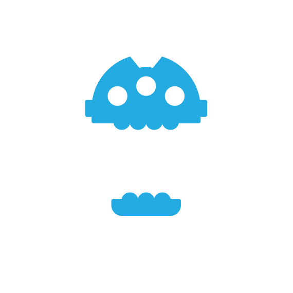
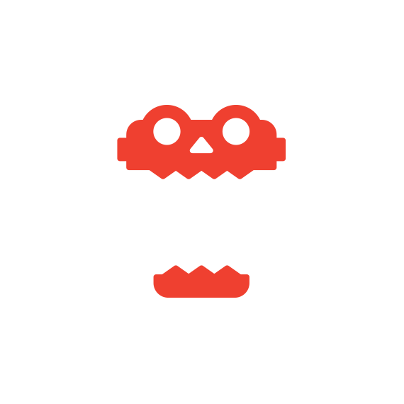
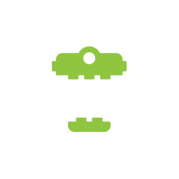
The general approach was graphic and playful, toying around the concept of a mutant mark. A logotype which is presented in several different forms, always maintaining a formal coherence between them. Both zombies and robots can be considered an ordered amalgam of components (pieces/mechanisms or rotten limbs). This logotype uses this concept to present a symbol built upon two different parts that can be combined in several ways. The symbol always bites the name, enhancing the conceptual zombie character of the name.

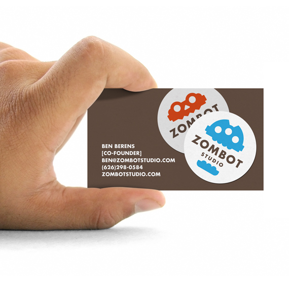
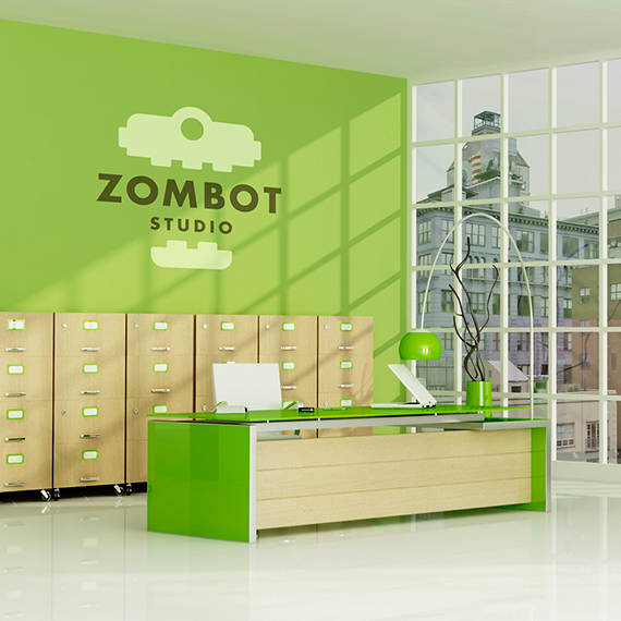
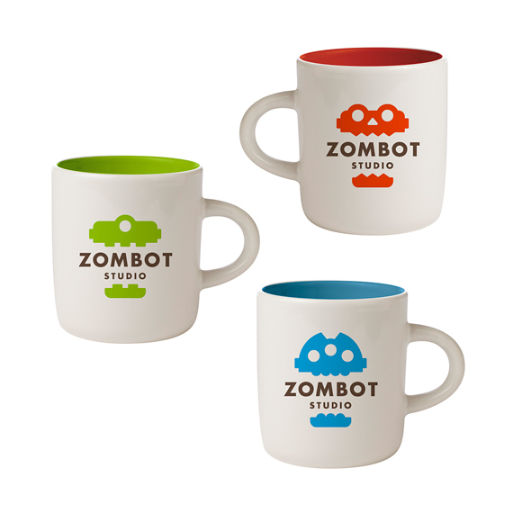
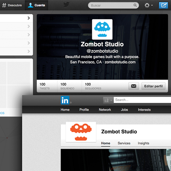
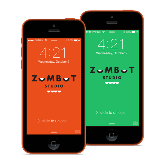
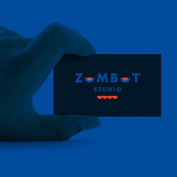
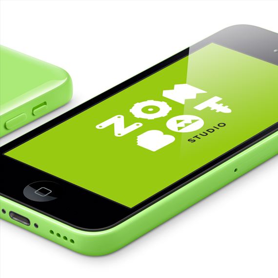
Applications
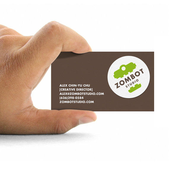
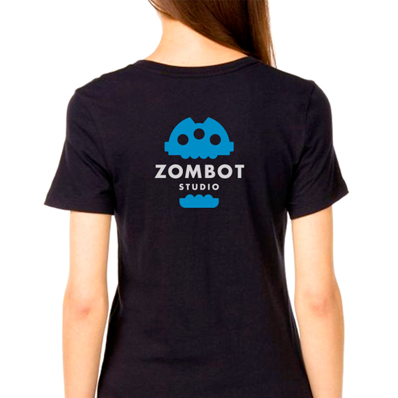
Several mockups were developed in order to exemplify the brand in use over a series of materials close to the client’s environment. Thanks to the use of such examples, the customer has a closer and more focused vision on the functionality and, lastly, value of the brand.
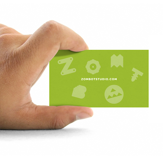
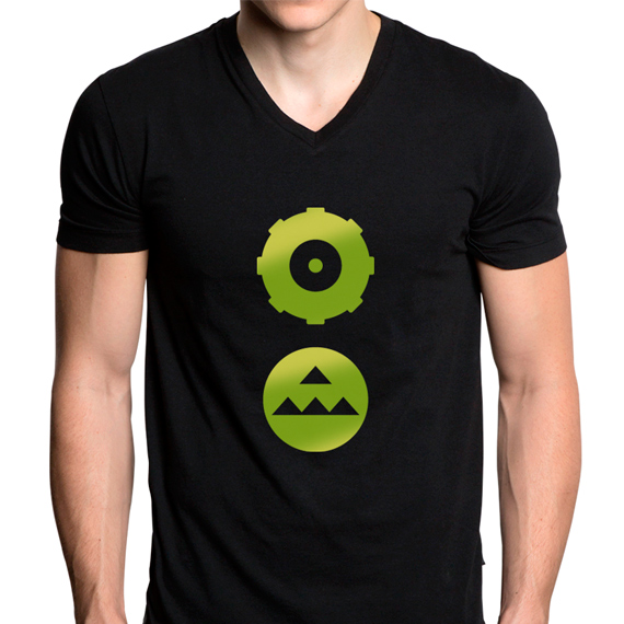
Other proposals
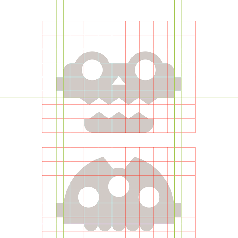
The main deliverable for the client included three differentiated graphic proposals, with the same goals, and communicative purposes, but using different solutions. Below, some stills with part of the alternative options.
My tasks
1. Conceptualization
2. Visual development
3. Graphic design
Tools
• Pencil & paper
• Adobe Illustrator
• Adobe InDesign


