Redea
BRAND DESIGN
Redea is born as the unification of a series of companies linked to the legal advisory, looking for a new common horizon united by similar interests and values, discarding the conservative and outdated trends of its sector. My mission was to develop a brand that spoke of the new company’s values, methodology and its overall concept. In a way, a visual expression of its foundations and projection.

Design process
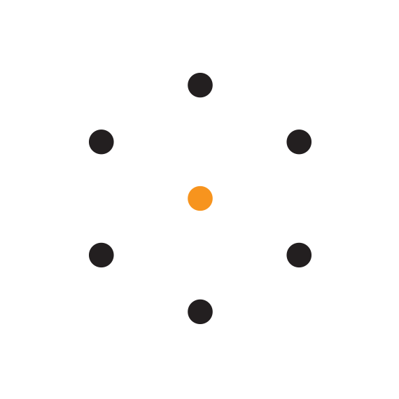
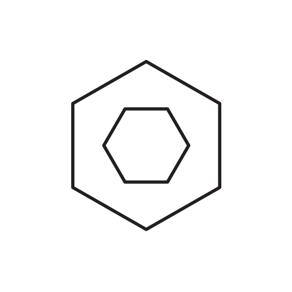
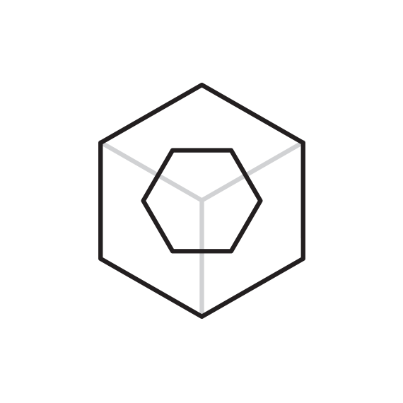
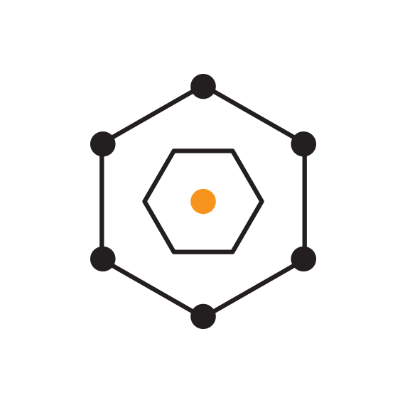
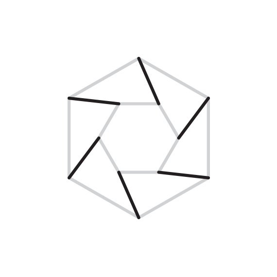
The proposal starts from a conceptual synthesis that ends up generating a compact visual proposal, simple and full of meaning. We start from the concept of network, where we see how different components of that network revolve around a common interest, value or objective that groups them together (1). On the other hand, we visually represent the double vision of business (internal and external), represented as a geometric figure that contains itself, on a smaller scale (2). Also, the hexagon is a flat representation of a three-dimensional cube that we can relate to the matrix organization that Redea defends (3). All elements can be combined in an orderly manner (4).
Design process (2)
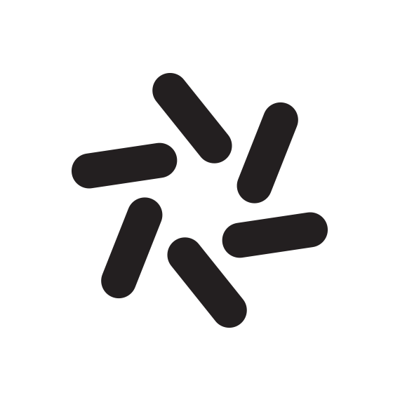
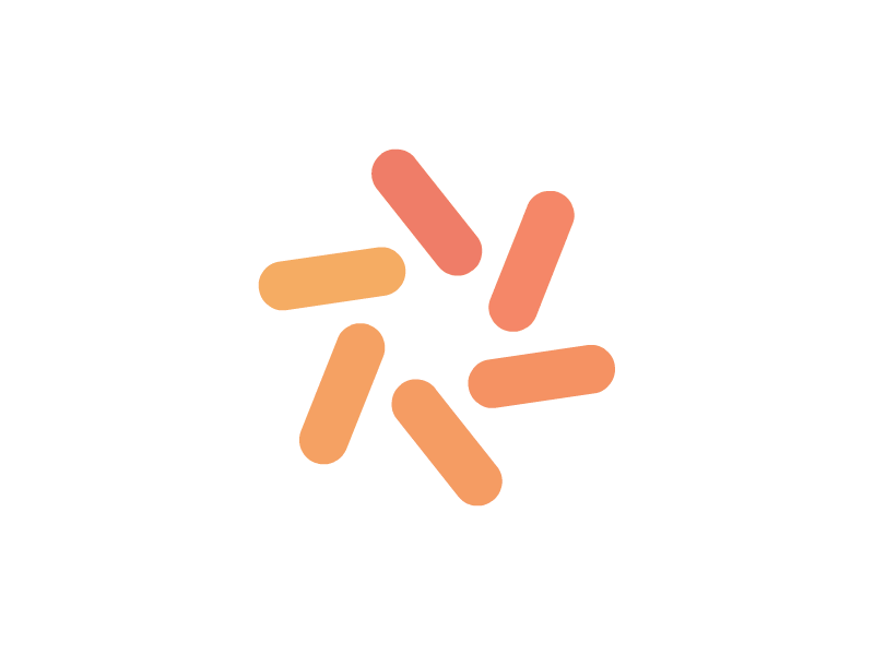
From the superimposed matrix, the points become linked to the central element, drawing lines in its path (1). By eliminating the initial points and the grid used as a base, we isolated the lines produced in the process (2). The result is a more compact element (3) that we can then tint, increasing the thickness of the lines, giving a smoother finish and reducing the spaces between each fragment. Finally, we rotate the resulting symbol 15º, to give it greater visual tension and a certain sense of movement in one direction (4). The symbol can work in large and small sizes, is visually memorable and easy to reproduce on any medium. The possibilities in terms of accessory graphics are also extensive.


Design process (3)
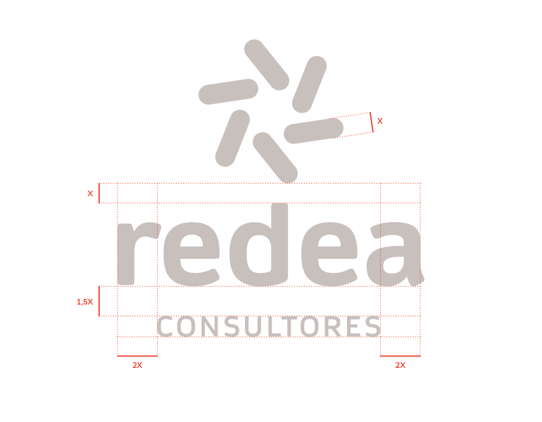
We combine the symbol created with an appropriate typography, with the name in lower case, so that no character has a greater hierarchy over any other. The name is compact, but the thick type provides weight and entity. Balanced with the symbol and the tag-line, it forms the complete mark (1). The typography is friendly but at the same time formal, readable and contemporary. The 'Consultants' tag-line is contrasted by capitalization, a higher tracking and a color tinge of the logo, so that it does not completely unlink the name. Finally, the chromatic choice divides logo and isotype clearly. The symbol presents a gradation of nuances, making each element is related but at the same time different (2).
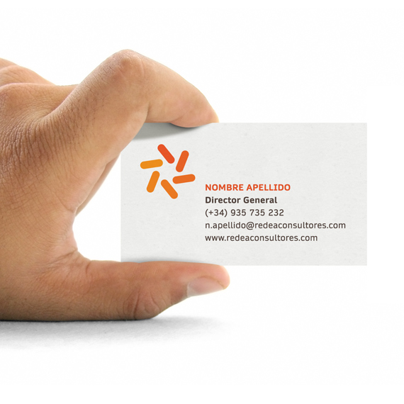
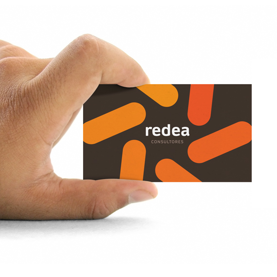
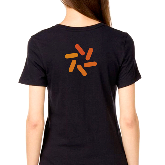
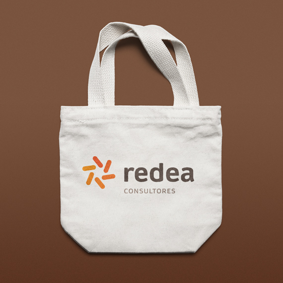
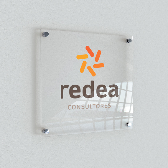
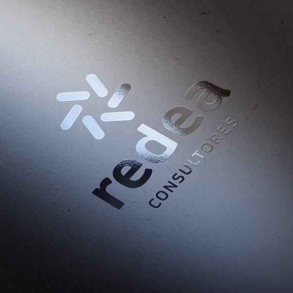
Applications
Several mockups were developed in order to exemplify the brand in use over a series of materials close to the client’s environment. Thanks to the use of such examples, the customer has a closer and more focused vision on the functionality and, lastly, value of the brand.
My tasks
1. Conceptualization
2. Visual development
3. Graphic design
Tools
• Pencil & paper
• Adobe Illustrator
• Adobe InDesign


