Break Advisory
BRAND DESIGN
Break Advisory is a company and online project born with the aim of completely reconfiguring the legal counseling sector. However, the project grew rapidly to get closer to any other professional sector, always with the basic concept of breaking with traditionalism. I was in charge of creating all its visual identity.
Design process and concept
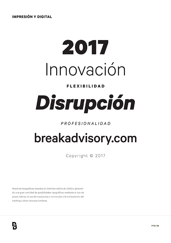
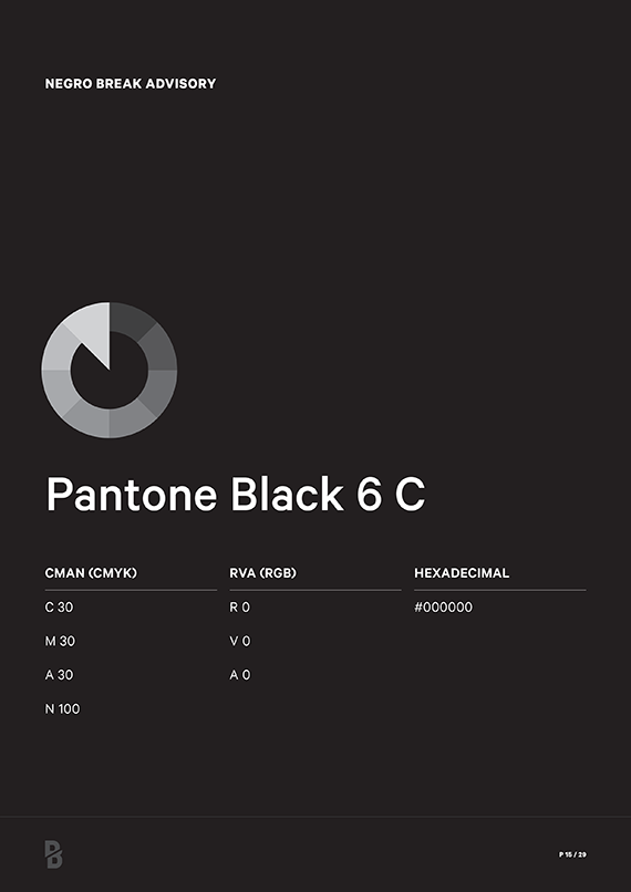
The brand is based on a solid and powerful symbol. A ‘B' split in two. A bold solution with an aggressive but honest point. This B functions well as an independent identity element and is easily recognizable. It can be used in various ways, creating even different ways of separating the two parts of the symbol, without ever losing its identity. It uses a resounding black, escaping trends of all kinds and focusing on the important. The typography is dense and with a certain bureaucratic character.
Constructive details
The Break Advisory brand has two distinct parts: symbol (isotype) and logo. Both parts can work together as a unified brand, but we can use the symbol independently (1). There is also a mono-line version for situations in which a very horizontal use of the mark is required (2). There are certain safety margins or spacing that must be respected to prevent the mark from losing its impact or being threatened by other graphic elements (3). The security area is based on a graphic element that is derived from the brand itself: the initial B of the main logo.
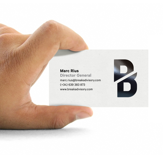
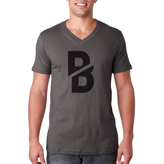
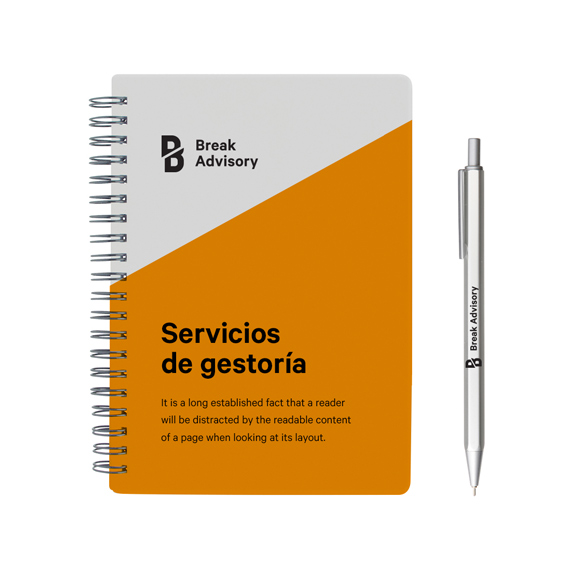
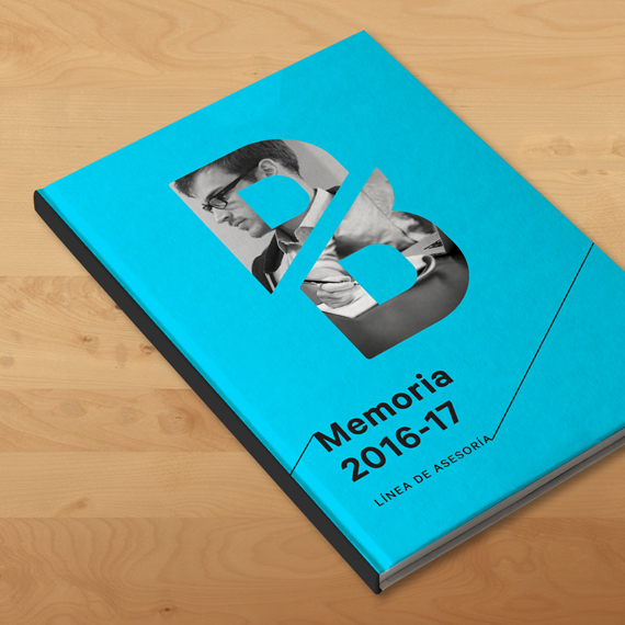
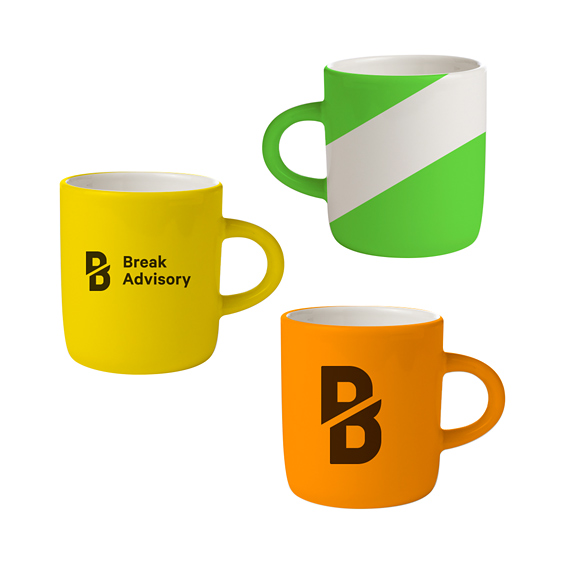
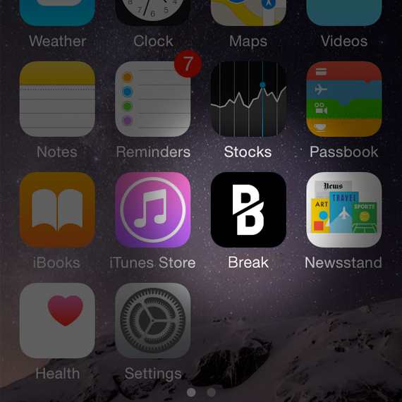
Applications
Several mockups were developed in order to exemplify the brand in use over a series of materials close to the client’s environment. Thanks to the use of such examples, the customer has a closer and more focused vision on the functionality and, lastly, value of the brand.
Brand guidelines
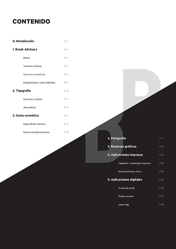
Along with the development of the brand, a 30-page visual identity manual was created, collecting all the information necessary for the correct use of the brand and its entire visual ecosystem.
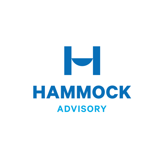
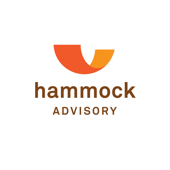
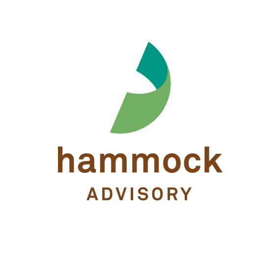
Other proposals
As it's usual for projects involving many partners, it was necessary to develop several design proposals —a total of seven well differenced but completely valid graphic paths to explore, to be precise—. Different naming proposals were also present at initial stages. These are some of those that were discarded along the way.


My tasks
1. Conceptualization
2. Visual development
3. Graphic design
Tools
• Pencil & paper
• Adobe Illustrator
• Adobe InDesign


