Telemaki
BRAND DESIGN
Telemaki was founded by two very young partners in their aim to create a quality Japanese restaurant and take away with competitive prices. With a great business vision and being aware of the value and impact of marketing, they decided to count on me for the development of their brand and all corporate communication materials at the beginning of their constitution. Currently, they have several restaurants and are in a continuous process of expansion.
Design process and concept
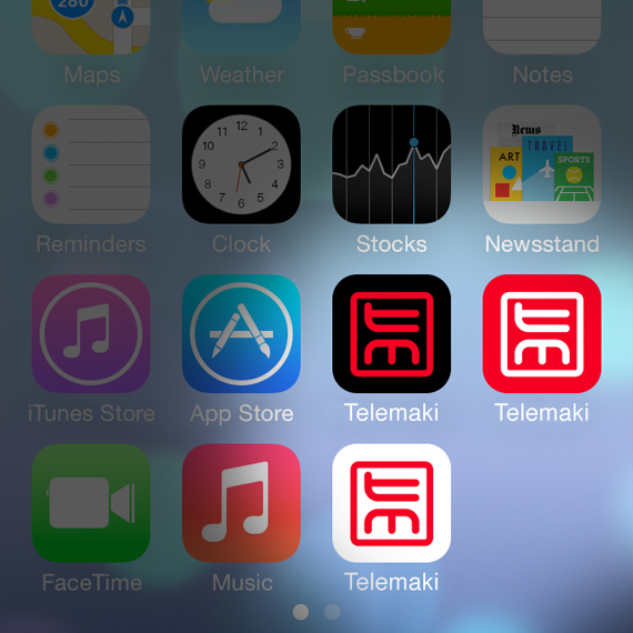
The strength of the brand lies with its imagotype, transforming the letters T and M of Tele-Maki into Inkan or Hanko, from the classical official Japanese signatures, recovering a traditional icon and converting it into something Western. We balance the overall design with a simple logotype that expresses clearly the name with a lower case typography, slightly spaced and condensed. The group provides a degree of satisfying balance between a typically Western brand with nuances of Eastern-inspired iconography.
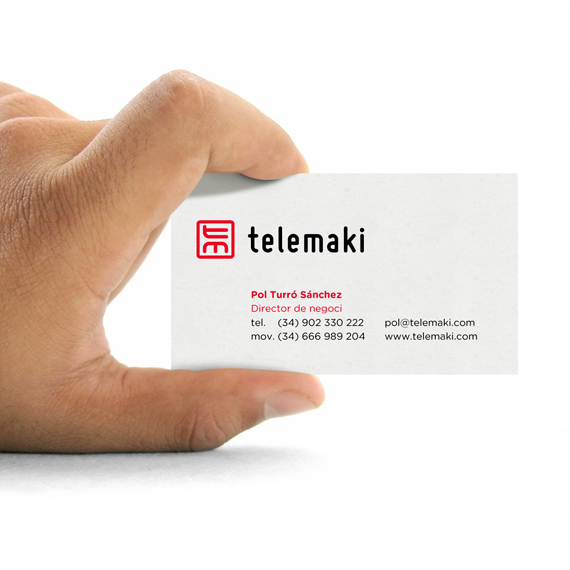
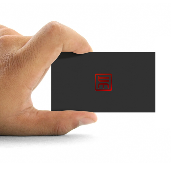
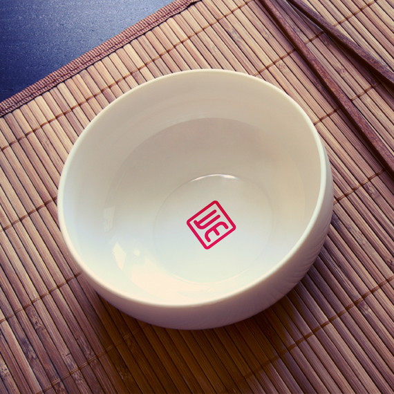
Applications
Several mockups were developed in order to exemplify the brand in use over a series of materials close to the client’s environment. Thanks to the use of such examples, the customer has a closer and more focused vision on the functionality and, lastly, value of the brand.
My tasks
1. Conceptualization
2. Visual development
3. Graphic design
Tools
• Pencil & paper
• Adobe Illustrator
• Adobe InDesign


