Vidal Forners
BRAND DESIGN
Vidal Forners is a company of recent creation, heiress of a long tradition of artisan bakers. In his presentation to the general public, its co-founders contacted me to elaborate their visual identity, from their brand to the main communicative pieces.
Design process and concept
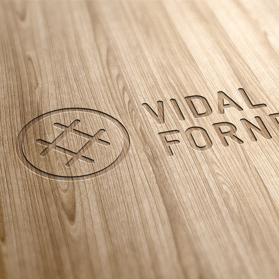
The proposal presents a logo that uses a typography of a certain weight and mechanical traits, with classic reminiscences of something rough, manual, artisan. This choice provides a traditional character, while its general layout, the use of supporting texts and a symbol with a modern finish, offers a suitable contrast between classic and contemporary. Past and present. We rely on the tradition behind the brand and take it to the present with elegance and sobriety. The symbol presents Vidal's 'V', resting on two iconic wheat spikes. It works as an independent identity element.
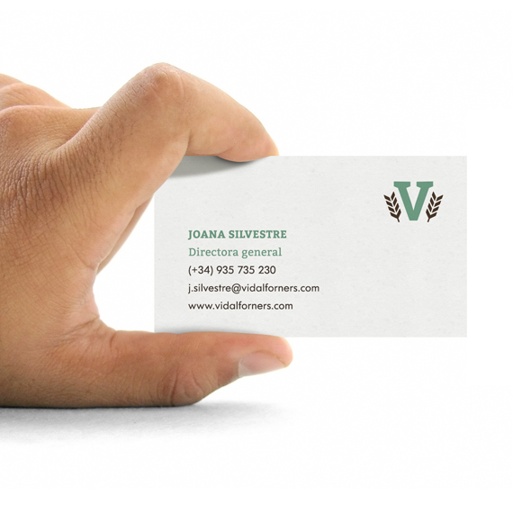
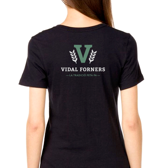
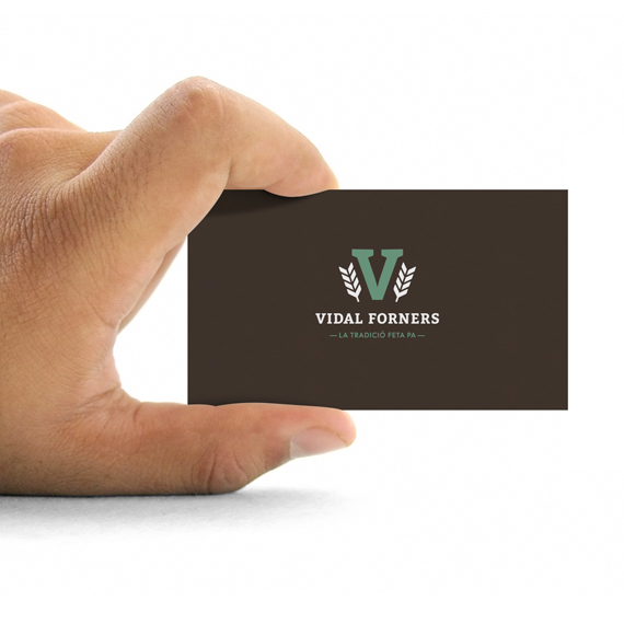
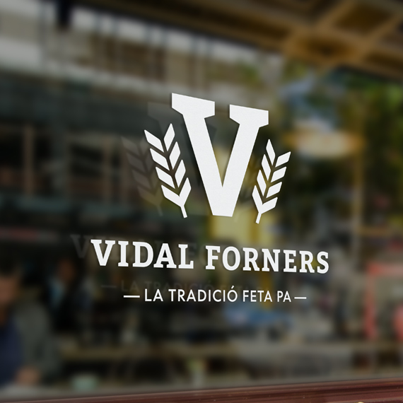
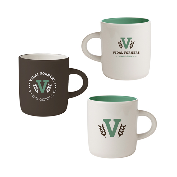
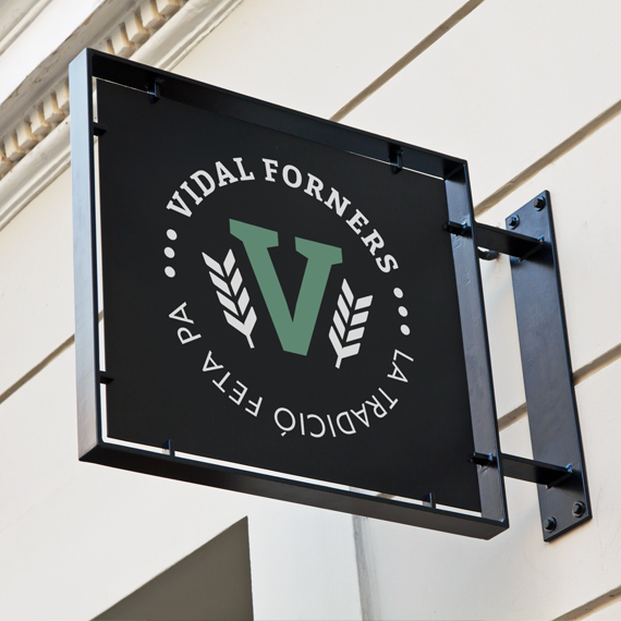
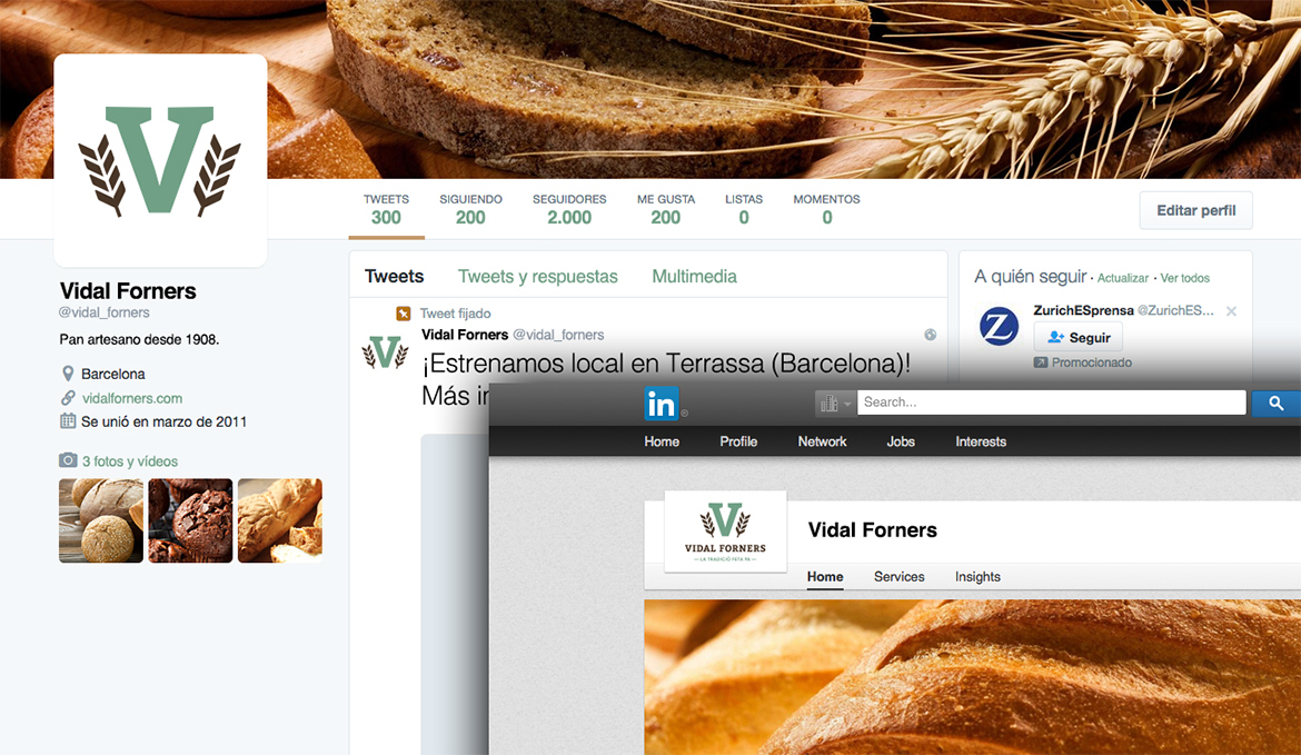
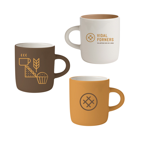
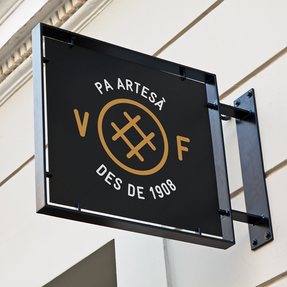
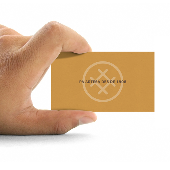
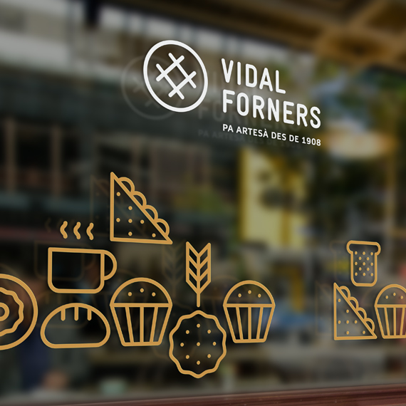
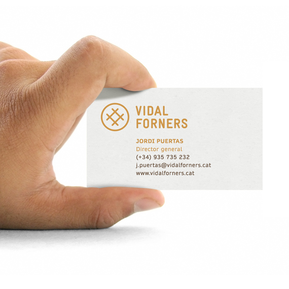
Applications
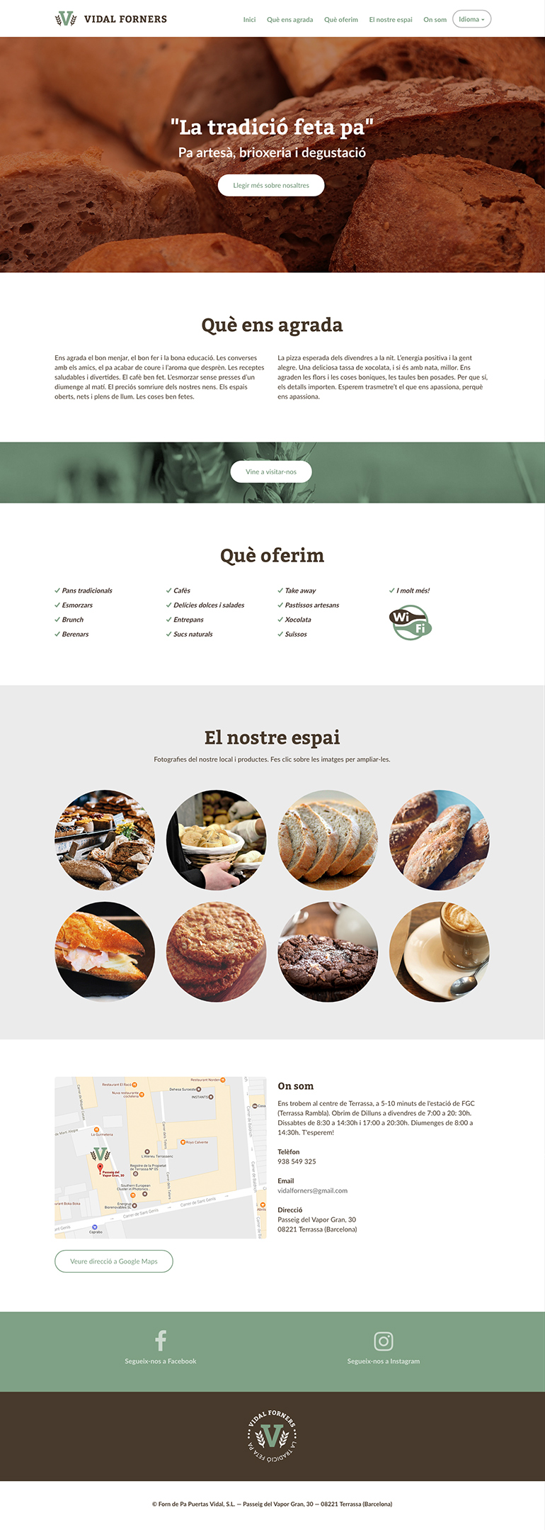
Several mockups were developed in order to exemplify the brand in use over a series of materials close to the client’s environment. Thanks to the use of such examples, the customer has a closer and more focused vision on the functionality and, lastly, value of the brand. A compact website was also produced, with a single structured page in three languages.
Other proposals
A double proposal was generated during the design process. While the first one was more classic, rough and related to the tradition and artisan factor, the second one was fun, modern and friendly, leaving behind the general trend in this sector. Despite being a valid proposal, it was finally discarded in favor of the first one.
My tasks
1. Conceptualization
2. Visual development
3. Graphic design
Tools
• Pencil & paper
• Adobe Illustrator
• Adobe InDesign


