Periferia
UI, UX DESIGN
In 2015, the communication and design agency Periferia Creative started a new professional stage in which they presented their new brand. Along with it, they decided to create a new corporate website affined to all their new conceptual and aesthetic approaches. Periferia counted on me for the integral elaboration of the design and conceptualization of their website.
Structure
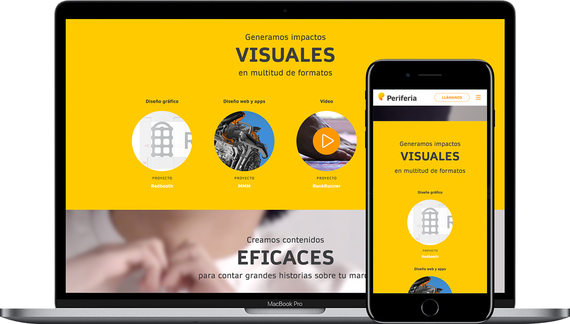
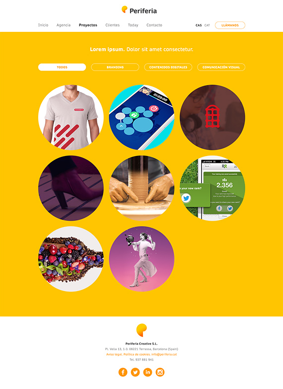
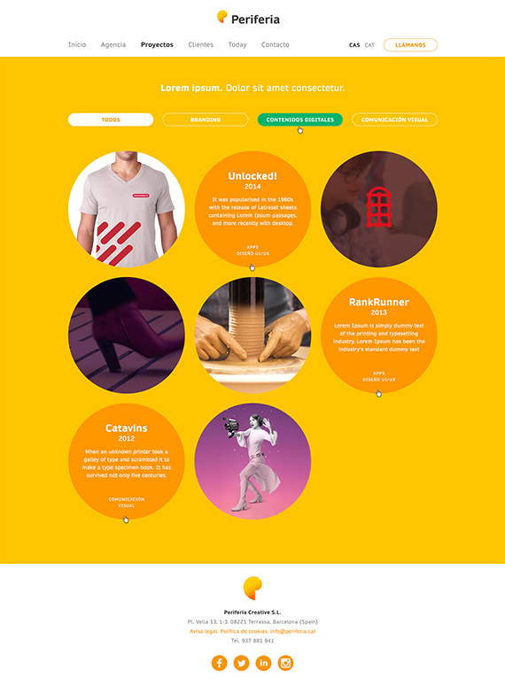
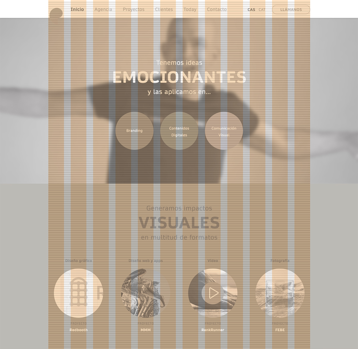
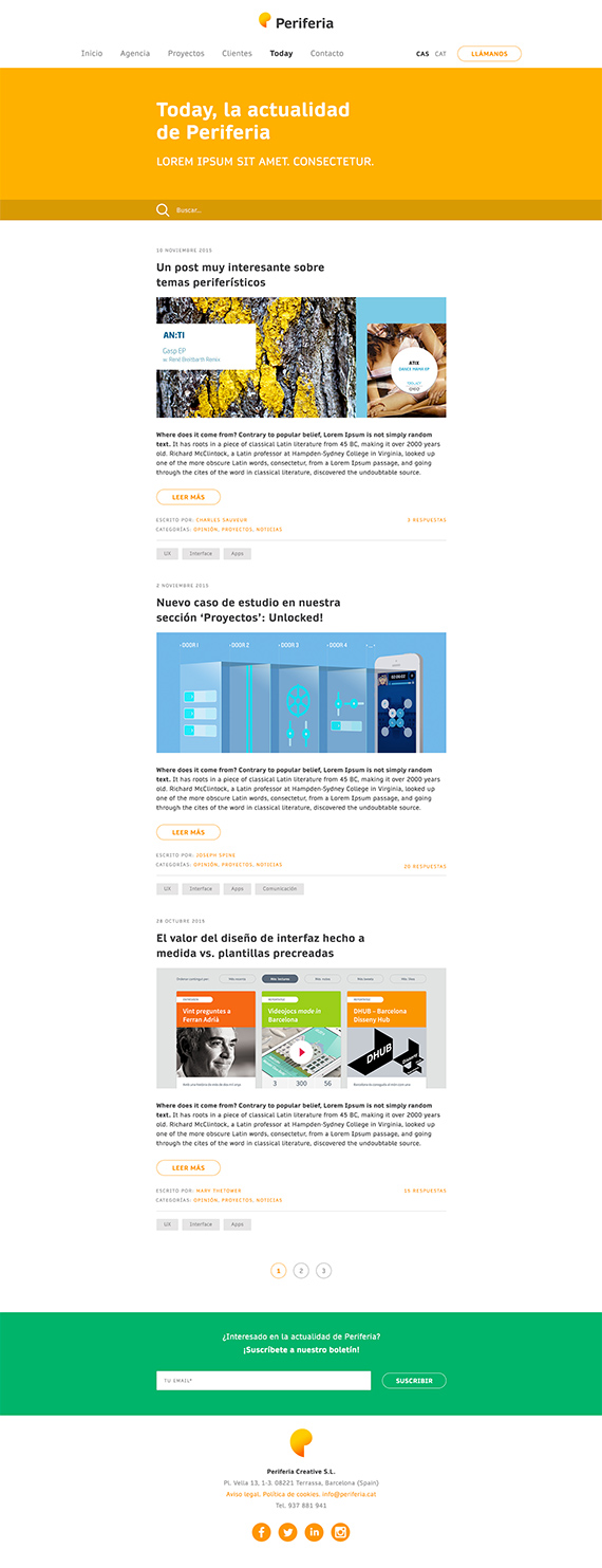
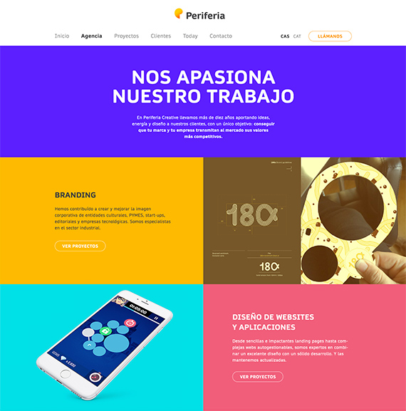
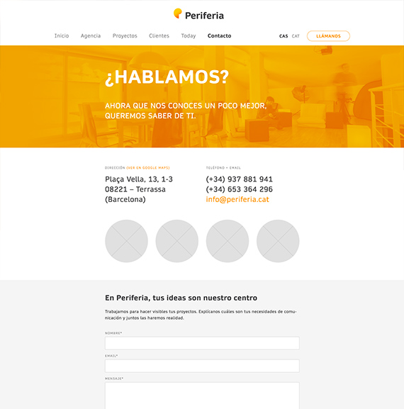
The general approach was to avoid complex structures, using just one level of navigation with direct access to the main sections. All the information was compacted to the maximum, with mono pages without derived pages, except in the case of the 'Projects’ section and in the corporate blog —titled ‘Today'. The overall result is a simple, unambiguous web, direct to the content of value.
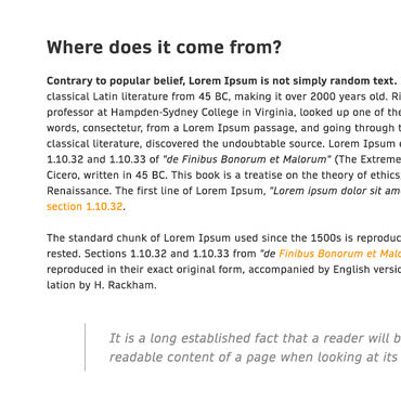
Rich typographical treatment.

Documented behaviours.
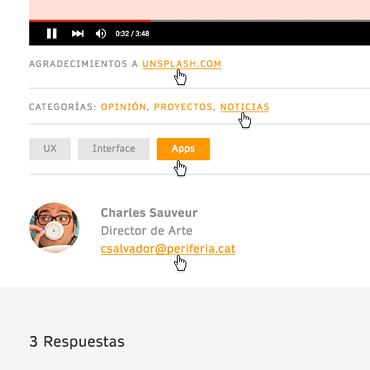
Attention to details and finish.
Art direction
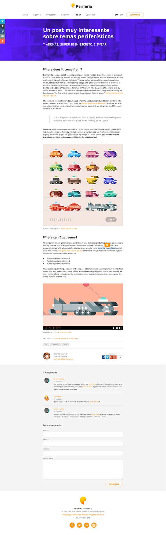
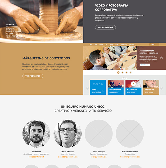
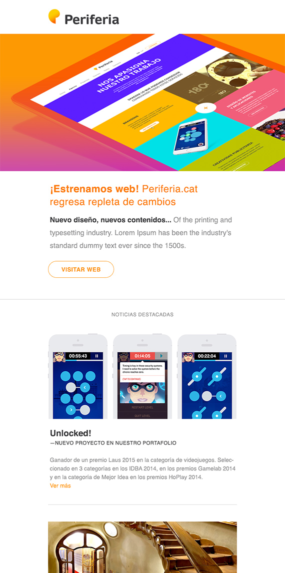
For its new professional stage, Periferia released their new image and, with it, the studio was detached from fears and neutral, boring solutions. Instead, the web was intended to reflect strongly a new approach, with large masses of saturated color, a simple but solid typographic treatment and a not at all timid use of images of certain impact.
My tasks
1. Functional analysis
2. Information architecture
3. Art direction
4. Visual design
Tools
• Pencil & paper
• Adobe Photoshop


