Gradhermetic
UI, UX, BRAND DESIGN
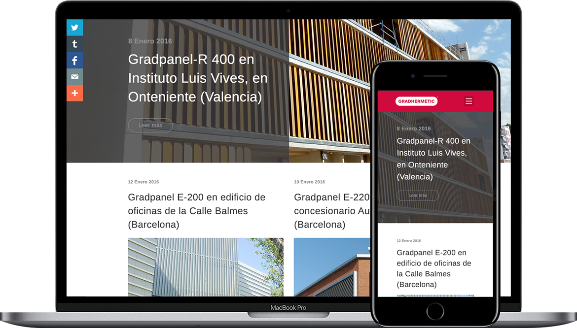
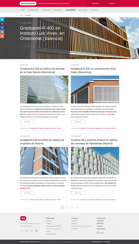
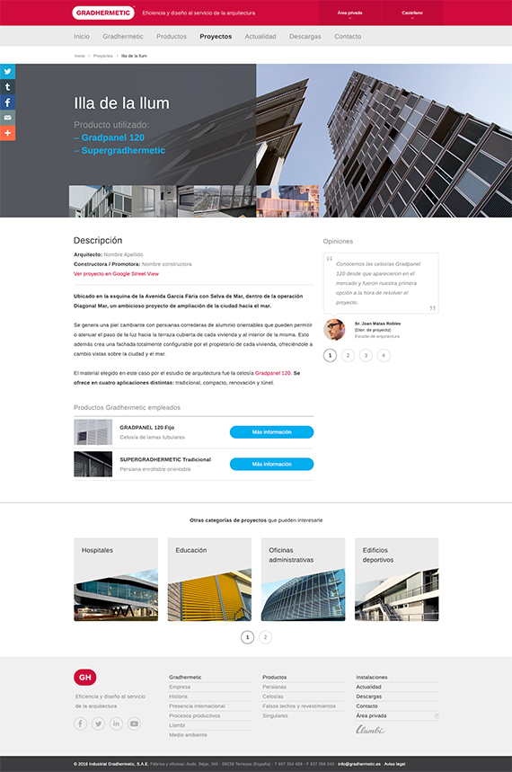
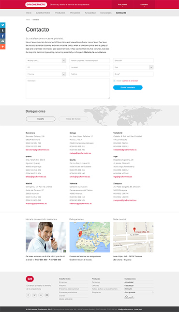
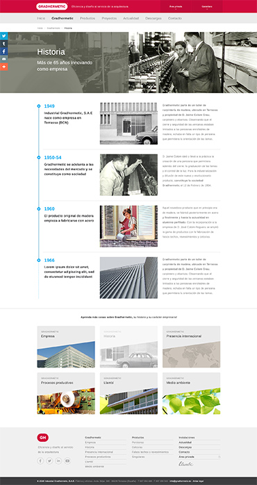
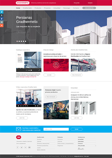
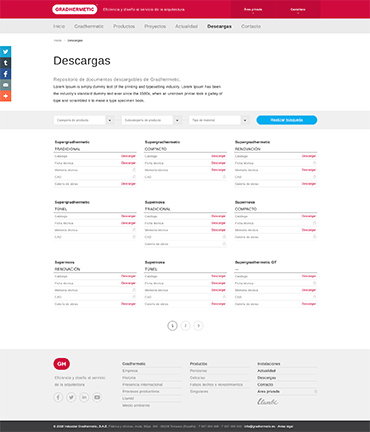
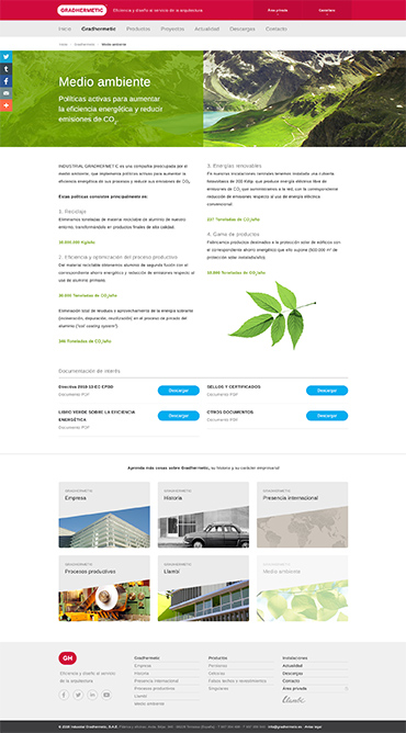
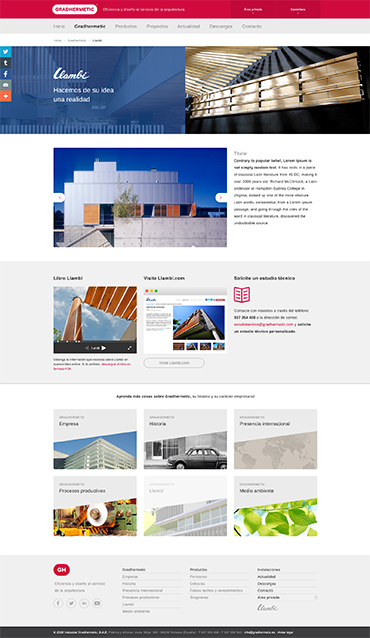
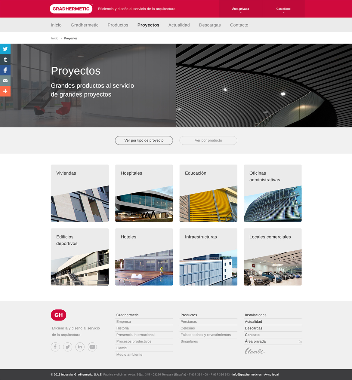
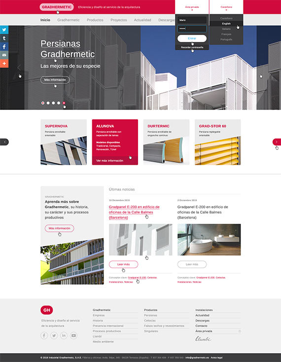
Periferia Creative contacted me for the development of the new website of Gradhermetic, a leading company in its sector. Their new website needed to resolve the quick access to their wide range of products. It was also necessary to implement a complete blog as well as a broad corporate section that talked about their history, values, international presence and their general processes.
Structure
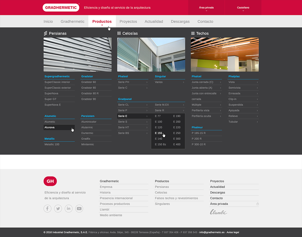
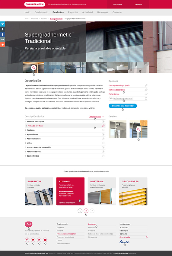
The structure of the website was complex, due to the presence of multiple simultaneous functions: exhibition of the company, its values and history, extensive display of its products, visibility of related architectural projects, corporative blog, etc. The product search and filtering system involved the presence of 3 base categories, 11 subcategories, 50 groups of products and hundreds of final products that had to be extremely accessible.
8
sections
37
psd files
2 mo.
development
112
Cups of coffee
Art direction
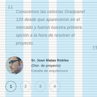
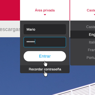
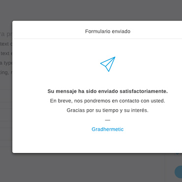
The entire website breathes an architectural tone. Clean, sober and well spaced. With well contrasted interactive elements, a simple but solid grid and a correct typographic treatment. Arimo was used as the global typography, because of its neutral, technical finish and its consistency with the general design of the site. The use of color was restricted to the corporate red, a range of grays and some additional tones for certain interaction elements and highlighted messages. Photography has a privileged role in the general interface of Gradhermetic.
Rigorous use of grids.
Attention to detail.
Documented behaviours.
My tasks
1. Functional analysis
2. Information architecture
3. Art direction
4. Visual design
Tools
• Pencil & paper
• Adobe Photoshop


